How to Design Eye-Catching Sidewalk Signs that Drive Sales: A Masterclass in Street Marketing
You have approximately three seconds. That is the amount of time a passerby gives your storefront before their attention drifts to their phone, traffic, or your competitor next door.
I’ve spent years analyzing retail displays, and the hard truth is this: A beautiful sign with a weak message is just street clutter. A “pretty” sign doesn’t pay the rent; a converting sign does.
Designing for the sidewalk is not like designing for the web. The rules of engagement are different. Today, I’m going to share the strategies I use to transform standard A-frames into high-performance marketing tools. We are going to cover how to design eye-catching sidewalk signs for sales, focusing on science, not just art.
Table of Contents
ToggleThe Sidewalk Sign Conversion Checklist
| Design Element | ❌ The Mistake (Ignore Me) | ✅ The Fix (Buy Me) | Why? |
|---|---|---|---|
| Color Combo | Red Text on Blue Background | Yellow Text on Black Background | High contrast prevents “vibration” and is visible from afar. |
| Typography | Fancy Cursive / Handwritten | Bold Sans-Serif (Helvetica/Impact) | Cursive is hard to read instantly; Sans-Serif stops traffic. |
| The Hook | “Welcome!” or “Open” | “Free Coffee w/ Sandwich” | Generic greetings are invisible; specific offers drive action. |
| Call to Action | “Sale Inside” | “Enter Here for 50% Off” | Direct commands lower the mental barrier to entry. |
The Science of Contrast and Color
- The “Yellow on Black” Rule: There’s a reason construction signs use yellow and black. It is the most visible color combination to the human eye.
- The “White on Red” Trigger: This combination triggers a sense of urgency (think “STOP” signs or “SALE” tags).
- Avoid Vibrating Colors: Red text on a Blue background creates a “vibration” effect that hurts the eyes and reduces legibility.
Size Matters: Matching Signage to Foot Traffic
One of the most common mistakes I see is businesses choosing a sign size based on their budget rather than their location’s dynamics. You must choose an effective sidewalk sign size for foot traffic.
Think about the “velocity” of your potential customer:
- The Slow Stroller (Downtown/Market Areas): If people are walking slowly and window shopping, a standard 24″ x 36″ A-frame is perfect. You can afford to use slightly smaller fonts and more text because you have high legibility distance.
- The Fast Commuter (Business Districts/Roadside): If your store is on a busy street where people are rushing or driving by, you need larger formats and massive fonts. In these high-velocity areas, using wind-resistant outdoor sidewalk signs is essential to ensure your message stays standing regardless of the weather or street turbulence.
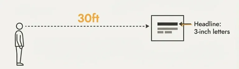
The Rule of Thumb: For every 10 feet of viewing distance, your letter height should increase by at least 1 inch. If you want someone to see your offer from across the street (30-40 feet), your headline needs to be at least 3-4 inches tall.
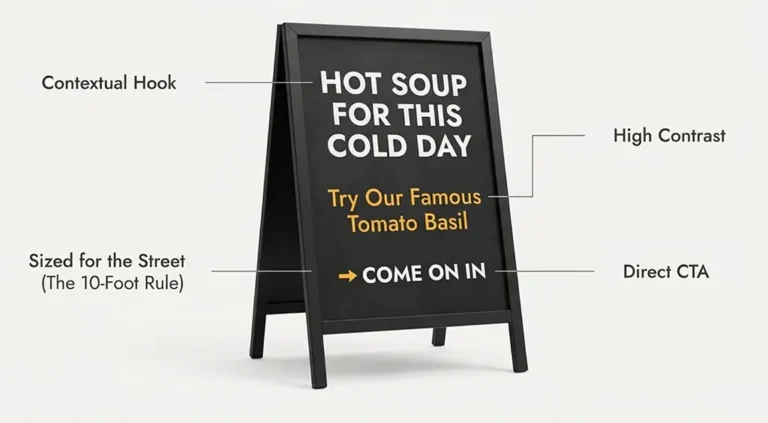
The "Coffee Shop" Strategy: Humor and Freshness
No one masters the sidewalk game better than baristas. A successful coffee shop sidewalk sign rarely just lists the price of a latte. Instead, it sells a feeling.
Coffee shops understand that the sidewalk sign is social media fodder. If you write something funny, people will take a picture of it and share it. For those looking to take this viral potential to the next level, mirrored sidewalk signs act as a natural “Selfie Station,” making your brand impossible to scroll past on Instagram.
Examples of "Hook" Content:
- The Witty Quote: “Soup of the day: Coffee.” or “Unattended children will be given espresso and a free puppy.”
- The Brutal Honesty: “Come in and try the worst sandwich that one guy on Yelp ever had.”
- The Contextual Offer: “It’s raining. We have dry seats and hot cocoa.”
This approach works because it builds a personality. It changes a generic “Business” into a “Local Favorite.”
The Call to Action (CTA)
A sign without a Call to Action is just a decoration. You must tell the customer exactly what to do.
Don’t just write “Summer Sale.”
- Bad: “50% Off Inside.”
- Good: “Come in to Claim Your 50% Voucher.”
- Better: “AC is On. Cold Drinks Inside. Check the Sale.”
You need to lower the barrier to entry. Giving them a non-monetary reason to enter (like AC, a free sample, or just a look) is often the nudge they need.
You can also check out our blog post comparing the conversion funnel in traditional advertising with that in digital advertising.
Frequently Asked Questions (FAQ)
How much text should be on my sidewalk sign?
Less is more. Follow the “3-by-5 rule”: either three lines of text with five words each, or five lines of text with three words each. If it takes longer than 3 seconds to read, it’s too long.
Should I use a chalkboard or a printed poster?
What are the best fonts for signage?
Final Verdict
Your sidewalk sign is the handshake before the hello. Make it firm, make it clear, and make it impossible to ignore. Ready to stop traffic? Browse our collection of high-impact sidewalk signs here.